
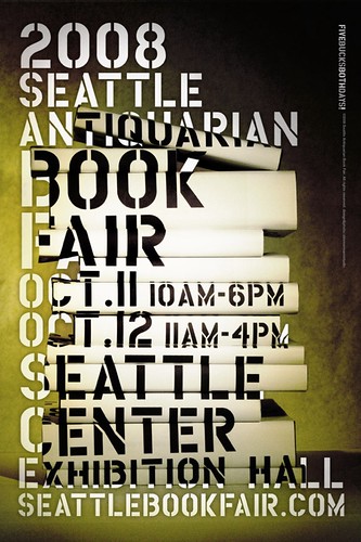
 It's Book Fair time again in Seattle, and this year's poster is another bit of photo/graphic cleverness from Zimmermann Studio.
Of particular insider interest is how difficult it was to follow up my own design from last year, so well-received by many. One-offs are easy, series are hard. After floundering about in the world of ornamentation and dense illustration, I settled back into a smarter, more cerebral groove. Always "bookish", the client reminded me.
So how did I create it? I first shot the stack of books without covers, then created a visual guide by overlaying the type for positioning. I then printed the type block in black on plain white paper and made custom covers for each book, taking care to position the type using my visual guide. Then I re-stacked the books, shot the photo and removed all areas of duplicated, overlaying type.
typeface: housebroken clean, house industries // photography & design: Denis Zimmermann // ©2008 Seattle Antiquarian Book Fair


No comments:
Post a Comment